Ruckus Rodeo, Red Grooms Dec 12, 2004~Feb 6,
2005
Ruckus Rodeo makes spectators participate with the clown of the rodeo
environment. Through his larger-than-usual size, walk-through work of art that covers 1,237 square
feet of gallery space, grooms shows Forth Worth rodeo alive. In preparation for
this wild, mixed-media work, Grooms attended every performance of Fort Worth's
1975 Southwestern Exposition and Livestock Show and made reams of sketches. Grooms completed
the major figures of the rodeo in his New York Studio. These figures, such as Butter the
Bull, the Rodeo Queen, the bronco rider. In fort Worth in 1976, with a group of
artists known as the "Ruckus Construction Co", Grooms completed the final
assembly of the figures, summarized from http://www.themodern.org/ruckus.html.
The works consist
of three dimensional sculptures, rodeo characters, and two dimensional
paintings, the audiences. Burlap paintings, on the ground,
stand for the sand in the rodeo field. The figure below shows the layout of the
rodeo I saw.
Grooms uses many techniques to express his ideas:
|
Picture |
Techniques/Design Principle |
Note |

The horse and the flying cowboy. |
The three dimensional sculptures contrasted
with two dimensional audiences, catch the spectators' focus.
The larger scale sculptures also let the rodeo itself becomes the
focus. You can easily notice that the flying cowboy is bigger than the
audience.
The flying cowboy's gesture and position imply the motion of the
Rodeo. |
The bucking horse and the angle of its front legs seem
like a groovy, puckish kids that fights with cowboys and powerfully
makes the cowboy flying out and another thrown into audiences.
|

Half horse reveal the collision to a cowboy. 
2D Audiences. |
The sculptures are actually larger than the
real Rodeo. |
 The hands on the ground.
 |
The burlap itself looks like texture of soil, but not
the same.
The hand and foot prints on the ground make you feel that someone
was there and let you feel the movement of time, and the time was just
frozen.
Through high-intense colors, and complementary color scheme, the
rodeo becomes more active. |
This kind of texture has sharper angles, which make the
art work look like cartoon style. |
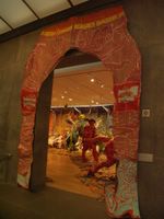
The Entrance of Ruckus Rodeo |
The position of spectators in the museum is in the
middle of rodeo field, which is not usual position when you see the
rodeo. |
We entered it from another entrance. The entrance is
actually between a cowboy's legs. You can see the use of chaps on the
legs. This is for protection against the back of the horse scraping
against skin.
By the way, I know this is humorous. However, in Chinese culture, it is
a shame to pass through someone's legs. It implies that the person who
passes the door would not be successful forever. |
 I can still feel I was watched.
 |
The audience is divided into two sections. One is in the
front and the other is in the back. Contrasts in elements are used:
- The size of the front is bigger and has more detail in it.
- The front steep white area strengthens the depth of the view, and
the back part is just a kind of two dimensional painting.
- For the back section, a monochromatic color scheme is used for the
seats and major part of the painting, which is in contrast to the
colorful front part.
- The lines of the ally in the painting and darker and smaller
sizes of the audience help to construct the space so that it looks
like a stadium.
- The mixed atmospheric perspective and linear perspective create
a very unique perspective.
|
I felt that different colors show different atmospheres
of the audiences, which increase the momentum and variety of the
environment. |

The hanging hat. |
Some subjects in the Ruckus Rodeo are
hanged in the air. This lets audiences feel the motion of the Rodeo. |
|
 Strange thin-body men.
 |
The two guys that hold up a person at
the gate are very abnormally thin and make me feel that these two guys are
taller than usual. |
In my opinion, Groomers does
not try to create another clown of rodeo show. Instead, he extracts his
observations and exaggeratedly transfer them into another form. |

Is she Rodeo Queen?
 The horse also looks at her. FUNNY.
 |
The complementary colors (green and red) are a very
bright combination that makes this piece active. |
The horse eyelash infers feminine and looks like a
figure in cartoon. This is a typical style of comedy, or say Pop art.
|
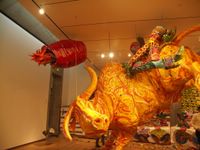 Struggling bull. Look at the movement!
 |
The impossible angle of human body on
the bull exaggerate the movement of violent shake when the cowboy
fighting the bull. |
|

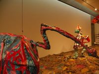 <----
What is this? The horse's tail, my Gosh.
---> Oh, this is another entrance of Ruckus Rodeo. It seemed something was
happening there.
Other works that sounds interesting
- The Burning Building
- Ruckus Manhattan, New York.
 <----
What is this? The horse's tail, my Gosh.




<< Home